TSW Conference
The TSIA organization needed a professional evaluation of their main conference website. I started my review with an evaluation of the primary users and goals. I presented my findings and recommendations regarding information architecture, navigation, usability, visual design, and content. I also provided contrasting examples with a comparative analysis against other conference sites.
Homepage - After
- Compelling graphics and better use of space.
- Improved navigation framework.
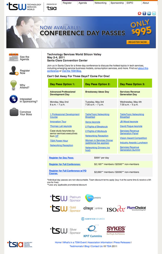
Homepage - Before
- The main graphic rotated dynamically but contained stock images which made it feel like a banner ad. I recommended using actual conference photos to reinforce the feel of a live event.
- Primary navigation at the top gets lost. Quick links on the left are mistaken as site navigation.
- Outdated style and boring content.
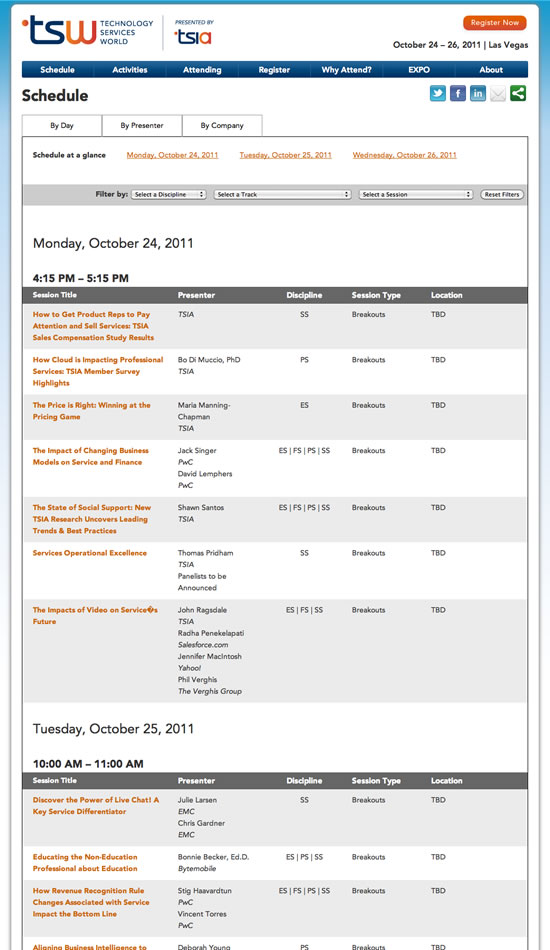
Breakouts - After
- Content is engaging and easy to scan.
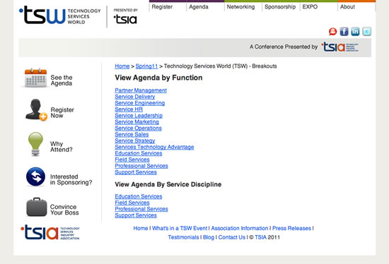
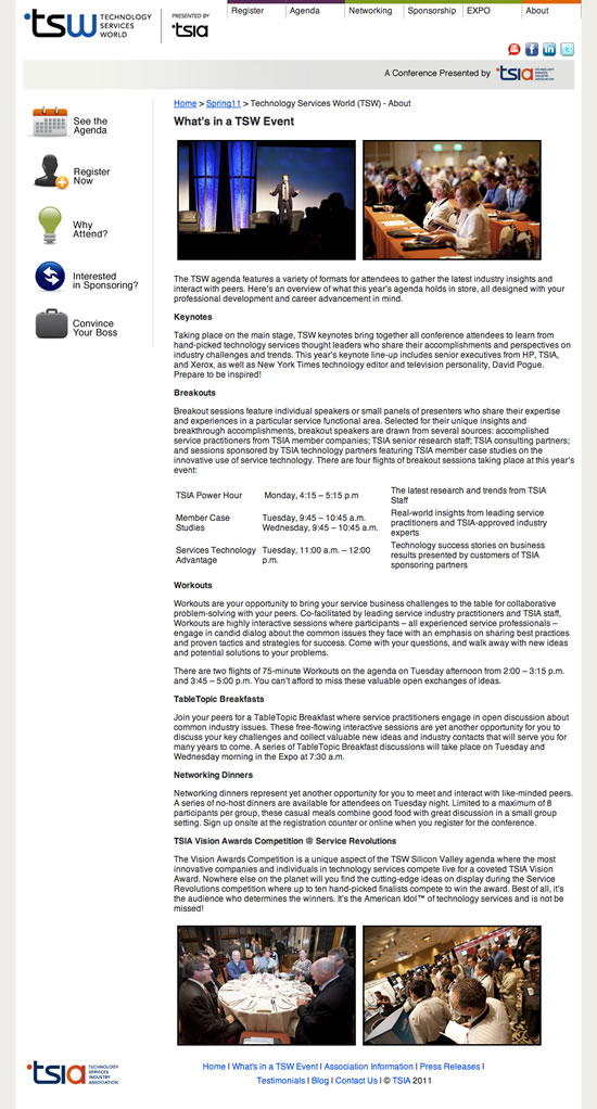
Breakouts - Before
- Forcing users to choose a filter before seeing any content creates frustration and disinterest.
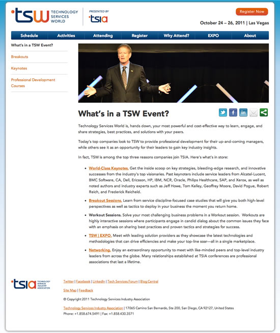
Events - After
- Content is easy to scan, and the corresponding sub-navigation makes sense.
Events - Before
- Too much text is overwhelming.

- Compelling graphics and better use of space.
- Improved navigation framework.